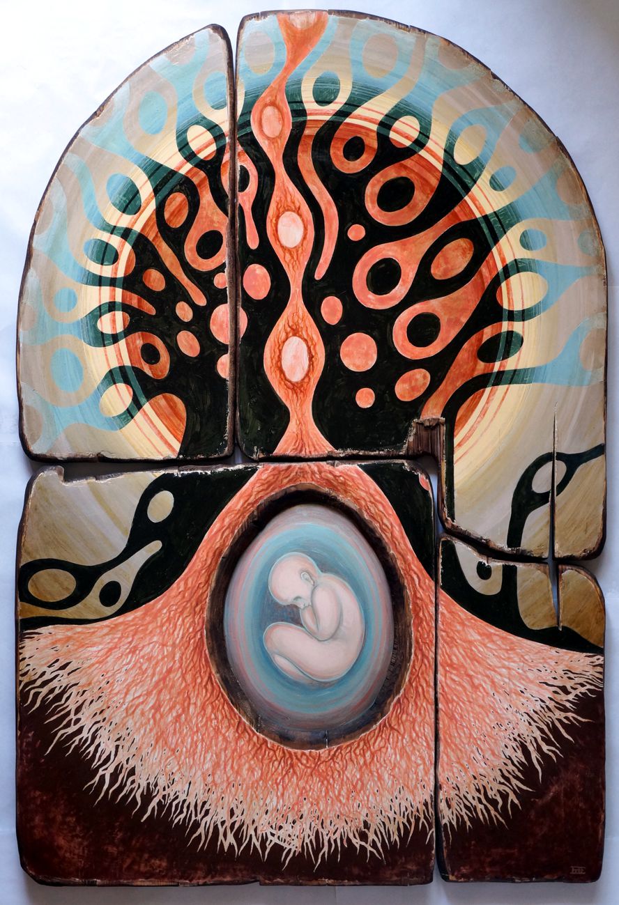
About ten years ago, or better, I started to be interested in cosmic phenomena, and theoretical physics, regarding the Universe, its evolution, and history (at least from what information I could find on the internet). I was especially fascinated by the idea of a Black Hole – which starting from the theory of relativity – that is created by the explosion of a vast sun, a point with an infinite gravitational force, from which not even light can escape, everything around is absorbed, and because of the infinite gravity TIME CEASES TO EXIST! Which makes physics pass into the metaphysical area! I integrated all these theoretical elements into my art, combining them with elements related to religious, Byzantine art, or graphic symbols with a spiritual charge. The first work with this theme was created in 2013–2014 and is titled LE DEVOREUR. I also held a personal exhibition, which originated from the idea of cosmology, and it evolved to become an integral part of my vision. Finally, I created a theory, according to which the galaxy we are in now, the Milky Way, is a vortex with a huge black hole at its center that absorbs everything. We are falling right now towards this Black Hole! And because of this phenomenon of stopping time, I consider it a form of memory, like a huge recording mechanism – like a disk, or a magnetic tape, but on a cosmic level – that absorbs and retains everything inside, and then time stops. All phenomena, everything that happens in the Milky Way (including here on Earth), is recorded there and, theoretically, can be viewed again if we had a device or mechanism that could reverse this vortex. A very interesting physical phenomenon, which has a kind of metaphysical, or spiritual opening... I had several works influenced by this theory of the vortex, including this latest work, in which an eye that appears in the middle of the vortex as a presence that takes notice of everything!
 |
| DE PROFUNDIS oil on wood and canvas, assembly 3 pieces, 121 x 121 cm, 2025, private collection Romania |
DETAILS:
 |
| RE-LIGIO tempera on wood, 100 x 110 cm, assembly 2 pieces private collection Italia |
About the name of the work: the term religion comes from the Latin "religio", which meant re-binding, re-connection, or restoring a link (with the divinity, obviously). The work is inspired by a visual element found in Byzantine icons – the hand of God blessing certain scenes or important events (a symbol I have not seen much in Catholic religious painting) – but is never found independently, being an element symbolically from an icon (visible in the left or right corner). I found interesting the idea of Malevich when he exhibited the work The Black Square, in 1915, and hung it in the exhibition in the corner of that room, as the Slavs traditionally hung the icons in the house, also in the corner of the room. And this decision was not an accident, because he hoped that it was the beginning of a spiritual revolution of humanity, an evolution towards a new spirituality, which was inspired by those revolutionary times that brought Communism and Nazism (in the end, it seems that he was sorely mistaken ). But I liked the idea that where it is displayed, it has a charge and can convey a message. So it will be an absolute condition if it will be exhibited or purchased, that it will be shown not next to the other works, as is generally done, but in the upper part, in a corner (as is also found in icons)! Because it would make no sense to expose it below, or in the middle, like other works. If someone accepts it in an exhibition it will be mandatory to accept this condition!
On the other hand, I find this graphic element related to the WI-FI symbol, which we all have on our phones or computers. I don't know if those who chose this symbol thought about it, or if this graphic formula of connection exists in a collective psychological substratum. Anyway, this is why I chose the name RE-LIGIO - as a symbol of the divine presence and the need to reconnect with It!


